The brief in this project is to create a portfolio website of no less than 3 pages. However, after looking at designs & doing a draft layout in my workbook, and also taking into account the possibility that this website may be used in the future either for college work or developed further for personal use, I have decided that 3 pages are not sufficiant for a portfolio site. I have therefore created a site of 7 pages with 2 connected galleries.
My first step was to outline a number of pages that I felt I would like to have as a portfolio. I fleshed it out with some rough details before settling on the final rough design. These sketches can be found in my workbook.
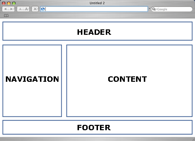
Some information found on the site below helped me understand how a wire frame functioned, having never encountered them before.
https://www.flickr.com/photos/henkc7/4053757728/in/photostream/
Wireframe Mockups http://webdesignledger.com/18-great-examples-of-sketched-ui-wireframes-and-mockups
I also used a fresh perspective when looking at the websites that I visited to try get a sense of the type of site I wanted to develop. Because my style tends towards the more simplistic I decided to settle on a very basic style that contained simple to follow links to both internal & external assets such as social media & image galleries. Also, I tried to use most of the concepts we used to create our first web pages & those found on W3Schools. I would have liked to use a few other tools such as javascript for my text boxes on the header of each page so that the text would change regularly, and also a liquid layout for the page layouts, but I decided to try stay within the range of skills we were dealing with in class.
So, my first sketches of the first draft are contained in my workbook, the finished wire frame layouts are below..

Here is a brief description of each page & some of the issues I encountered in designing them.
The Home Page.
This website is designed around most of the code & the concepts discussed in class & this page is definitely no exception. However, I did have an issue with the code used to place the 3 introduction boxes in line in the center of the page. Similarly with the text boxes on the header panel.
I overcame these issues by creating ID’s with the following code.
#headerbox1{
margin-top: 30px;
display: inline-block;
border-radius: 15px;
background-color: yellow;
padding: 5px;
width: 250px;
height: auto;
border: 2px solid #000000;
font: message-box;
}
And…
#rcorners6 {
position: static;
border-radius: 50px 15px;
background: red;
padding: 20px;
width: 200px;
height: 150px;
margin: 10px;
margin-top: 50px;
border: 2px solid #000000;
}
The Home Page & the About Me page are shown below. The About Me page is a very simple page that didn’t require much of a departure from the code used in class. However, in the final review of my website I decided, on the Home Page, to change the colour of the “Corner” panels to yellow as I felt it fit more with the colour scheme of the rest of the web site. I also reversed the direction of the curved border on the panel on the right to bring the eye back in to the page rather than leading it to the right & out.


The Services page was a little more tricky. Again the basic code for the page remains the same, however, I wanted to create a set of difined areas in the center of the page that would contain information & links to content. I found that the simplest method to achieve this was to use a table layout to create a 6 sectioned area.
Inside each section I then placed a content box with the CSS code I developed for the “Corner” sections used on the Home Page above. This allowed me to place any type of content inside such as text, links or even an image. Info on the table code used can be found here

In this website I have used 2 types of gallery. The first can be found on the gallery page & used the code found here on W3Schools. This set up a number of placeholders into which I placed an image & the image information. I found this to be a little limited in that I could not see how to easily add a slideshow function. I also placed an embedded video of my images in an i-Frame on the right side of the page.
The second gallery I used was created using Adobe Bridge. Selecting a panel of images I selected a desired layout style with the relevant contact information etc. & output the slideshow mini-site to my website directory. I then just linked my webpage to the slideshow index which displayed it just like any other page in my website.


For my Store Page I have divided the page in to two vertical half’s. On the left hand side I have used another table, this one with 2 columns & 3 rows. In the left column I placed an image & a PayPal linked buy now button. (All PayPal linked buttons are fully functional.) In the right hand column I have placed descriptive text.
In the right hand vertical column I have place centered text with a PayPal button to pay for services.
The Last 2 pages of my site are very similar in that they have the same vertically divided page, one side showing an appropriate image for either the contact page or my blog site. Descriptive text & links are contained in the other half.


On reflection & other feedback I have changed the font to “Dosis”. I have seen this font used on another website & found that it is both easier to read & lends a more playful air to the website.

This is the website I took my font inspiration from.
Further Research:
Reading as listed in the Bibliography under Web Design.
Very clean design layout. https://www.everlane.com/
Really, really love this site. http://www.intersection.is/
http://www.dtelepathy.com/blog/inspiration/30-bold-and-clean-web-designs-for-inspiration
Favicon Generator. http://www.degraeve.com/favicon/
What is a favicon?
Favicons are the little icons that show next to bookmarks and in the address bar of most browsers. Favicons are 16 pixels square. Upload a picture and click ‘Make Favicon!’ to create a favicon for your website. This favicon generator supports alpha transparency.
Once you create your favicon.ico file, upload it to the root directory of your website and put the following code in your html page in the header: