This project was presented to us as a live project for the college canteen. The final design concept may be chosen to be used to represent the company on all 3 campus canteen’s.
We are to produce the following:
- Logo
- A4 Menu Template
- Chalkboard Design
- Inspirational Quotes to be used on the tables
- A3 Poster on benefit of a particular fruit or Veg.
I also plan to provide as an added value bonus a business pack consisting of a business card, letterhead, Facebook banner image, food ingredient sign & a compliment slip.
We began with a meeting with Maria from the Curly Kale where she set out their, initial, needs for the design. These would change as the project progressed but that just gave us a good insight into how clients approach the process of presenting their thoughts to a designer so it was good experience.
From this initial meeting I began to tease out some early concepts.
Having researched the Kale plant I found that it has a very distinctive view from above. The edges have a very serrated edge that I felt could become a strong basis for the core of my concept.

I began with some early sketches to play with the idea. I realised from early on that my logo would concentrate on a representation of the Kale from above. I also felt that it would be rendered as a digitally created file, for two reasons.
Firstly, my drawing skills could not produce something like this to a commercially acceptable level. I could of course contract an illustrator to do this were it a totally live project but being a college project I believed this would be unacceptable.
Secondly, from a design standpoint, I felt that the Kale was far too busy looking a plant to be faithfully & cleanly rendered so I planned to create a minimalistic representation of it. Below is the evolution of the early concept.
This PDF shows the evolution of some of my logo ideas. CurlyKale copy
I also conducted a bit of research on the company themselves but being a very young business there was nothing available about them.
I then decided to speak with the 3 owners of the company to see if I could get any more information. From a number of meetings I was able to get a general idea of the style of content they wanted though nothing more than an idea.
I presented the clients with a design brief in which I had laid out what I thought the best approach was, what kind of tone I believed the company was aiming for and other questions & statements. I left this with the owners for 2 weeks so they could consider it in depth & make changes & additions to it where the felt they had something to contribute.
They did not make ANY changes to the brief.
I also included a SWOT analysis in the brief, the complete document can be found here.
After researching a number of vegetables & their benefits I decided to use the humble Sweet Potato as my chosen vegetable. Partly because I liked what you can do with one but mainly because I think it’s a damn fine looking Veg. It has character.

I sketched 2 versions of the sweet potato before choosing one for use in my set of quotes & poster.
I drew them on acrylic paper to give the image texture & a bit of depth. I drew it in black ink then imported it into Photoshop where I colourised the potato & leaves.
I felt the finished image looked really well on the poster & quotes, though in the end I decided to place the quotes on the A4 menu which would be on each table. I felt this would give the best exposure to the quotes.


I began to further develop my logo concept to a point where I could get some feedback. It was suggested that while the logo was on the right path, it was perhaps a little too clean & digitally produced. A bit more of a random & organic look to the design might benefit the logo.
When looking for inspiration for the colour palette I found examples in many places. I found that I was been drawn to a very light pastel range of colours, pastels being one of the requirements from the client. I found a menu that incorporated these kind of colours & also a wall sign in the airport.


Other inspiration for menu & palette design.

The final colour palette can be seen here.
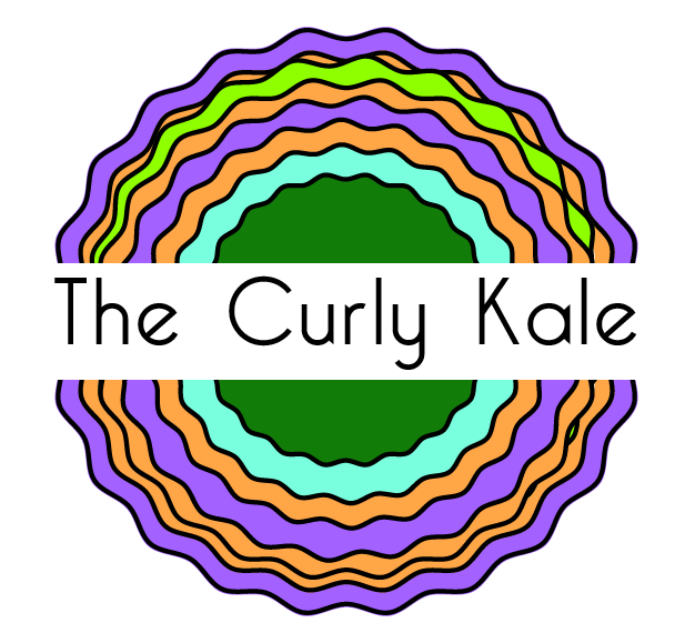
Taking the regular feedback meetings on board I produced a logo that I felt was a good fit for the company. It incorporated the colour palette I had chosen to work with & had a much more organic look to the way the curves of the plant interacted. I then began to apply the logo to the rest of the design elements.
As you can see I used an uneven spreading of the various rings, some almost overlapping completely. I also used a much thinner stroke for each ring. These two changes gave the design a lot more subtlety & a natural feeling.
I designed the other elements around the logo & colour palette. I used the logo placed on the side of the chalkboard & left a very simple layout of the information in the centre. I made the decision to keep it fairly simple due to the very un-organised & chaotic layout of the previous design.
I then designed the A4 menu to be displayed on the tables. I made a conscious decision to design this as a landscape menu for a number of reasons. Firstly I felt that a flat A4 menu on the table doesn’t add any character to the table. It’s easy to just fall in to the habit of printing an A4 sheet out & planting it on the table. My design was to make an uprite DL shapped tri-fold menu to be held in an acrylic holder as below. This would add a little more personality to the canteen.
I also designed it with the space to insert a random saying or message that could be changed at any time. The entire menu was formatted as a word document so that the staff could change it as needed.


Menu Designs.
The business pack & all the other designs can be found on the final A2 layouts here.
Finally, I presented a style guideline document for the client to refer to should they decide to add any elements to their identity. Logo Guidelines Kale
